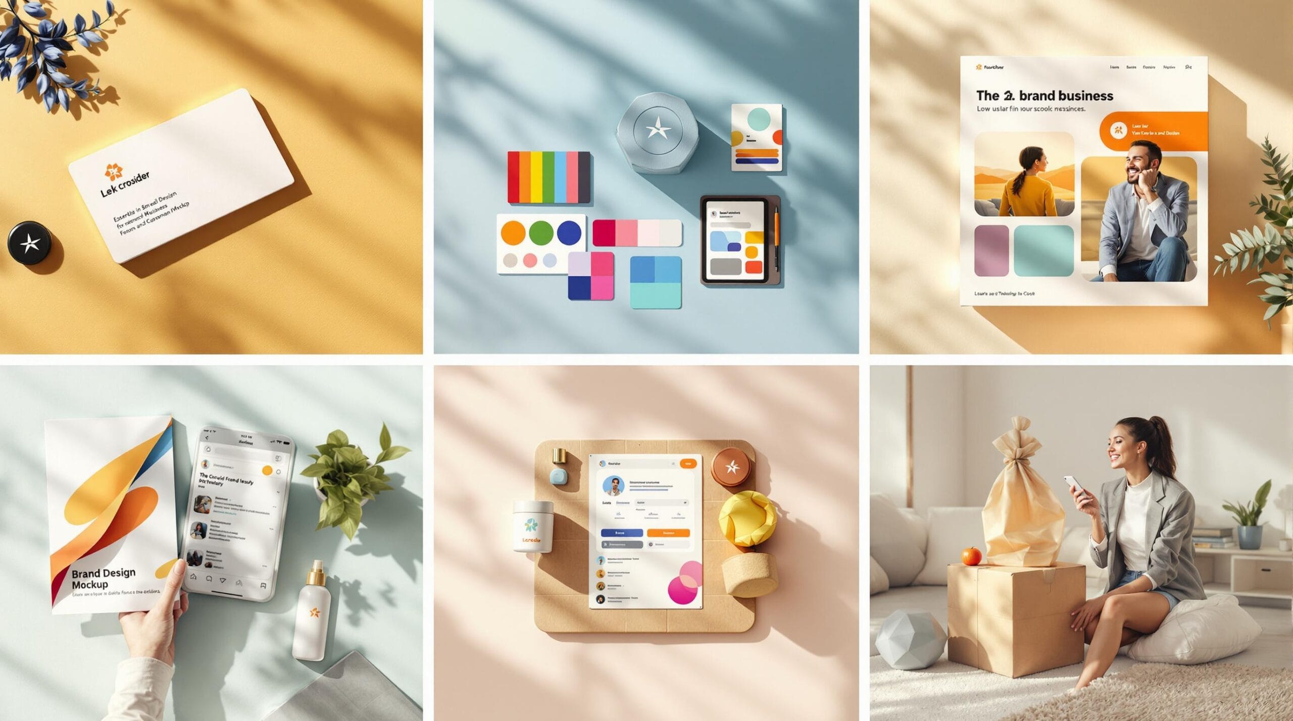
A successful brand is more than just a logo – it’s about creating a consistent identity that builds trust, recognition, and connection with your audience. Here are the 7 key elements every small business needs to focus on:
Why does this matter? Consistent branding can increase recognition by up to 80% and make 55% of customers more likely to choose your business. Start with these steps to create a brand that stands out and connects with your audience.
Did you know that 75% of consumers recognize brands by their logos? This makes your logo a critical part of your small business’s success. It’s the first thing people notice and sets the tone for how they perceive your brand moving forward.
A strong logo balances simplicity, flexibility, and relevance. Start by choosing the right type for your business – whether it’s an icon, text-based, or a mix of both. Focus on clean designs that look sharp at any size, and pick colors that reflect your brand’s personality and industry. For example, blue often conveys trust, while green is associated with eco-friendly values.
Here are some essential logo variations to consider:
| Logo Version | Primary Use | Key Features |
|---|---|---|
| Full Color | Main branding | Includes all brand colors, high quality |
| Monochrome | Black/white backgrounds | Single color with clear contrast |
| Simplified | Small applications | Minimal details, easy to read |
| Icon Only | Social media profiles | Recognizable even at tiny sizes |
"A logo is the first thing that a potential customer will notice about your business, so it’s crucial to make a good impression." – Paul Rand, renowned graphic designer
A professional logo doesn’t just look good – it builds trust. In fact, 60% of consumers are more likely to trust brands with well-designed logos. To get the most out of your logo:
Once your logo is ready, the next step is choosing a color palette that complements and strengthens your brand identity.
Brand colors go beyond just looking good – they directly influence how customers perceive your business and can improve recognition by up to 80%. These colors are a core part of your visual identity, just like your logo. They should reflect your brand’s personality. For instance, a yoga studio might lean towards calming tones like soft blues and greens, while a high-energy brand might opt for bold reds and blacks.
To maintain a cohesive look, define a clear color palette with these key elements:
| Color Type | Purpose | Examples |
|---|---|---|
| Primary | Main brand identifier | Logo, headers |
| Secondary | Supporting elements | Buttons, accents |
| Neutral | Background and text | Website body, documents |
| Accent | Highlight key actions | Call-to-action buttons, alerts |
Make sure to document your color codes in multiple formats like HEX (#FF5733), RGB (255, 87, 51), and CMYK (C:0 M:66 Y:80 K:0). This ensures your colors look consistent across all platforms, from your website to printed materials.
Colors have a powerful psychological impact – 60% of consumers decide how they feel about a message based on color alone.
"The right color palette can increase customer trust and recognition, while the wrong one can disconnect you from your target market entirely." – Color Marketing Group, 2024
Here’s how some common colors are often perceived:
Once you’ve nailed down your brand colors, it’s time to think about fonts that complement your brand’s personality.
Typography plays a big role in how people perceive your brand. The fonts you use can leave a lasting impression and instantly reflect your brand’s personality. Research has shown that consistent use of typography boosts brand recognition and helps customers connect with your message more effectively.
To maintain a polished and professional look, stick to a limited set of fonts. Ideally, choose:
Limiting your selection to 2-3 fonts keeps things clean and easy to read. For example, Google uses just Open Sans and Montserrat across its platforms, creating a seamless and recognizable style.
For best results, follow these tips:
Consistent typography doesn’t just look good – it helps build trust and makes your brand more memorable. For small businesses, this can be a key factor in standing out. Choose fonts that reflect your brand’s values and are practical for daily use. Resources like Google Fonts offer a wide range of professional options that won’t break the bank.
Once your typography is in place, you can focus on adding visuals and images that connect with your audience and elevate your brand further.
For small businesses, visuals can make a big impact. They help create a polished, memorable impression – even with limited resources. Smart use of visuals allows smaller brands to compete with bigger players and stand out in busy markets. Research from BizIQ shows that businesses with consistent visual branding are more likely to stick in customers’ minds.
Your visual strategy should fit each platform while staying true to your brand identity. For example, Instagram might call for eye-catching, colorful images, while LinkedIn benefits from a more polished, professional look. The key is to keep a unified style across all platforms.
Here are some core elements to focus on:
| Component | Purpose | Best Practice |
|---|---|---|
| Product Photography | Highlight your offerings | Use consistent lighting and backgrounds |
| Brand Graphics | Reinforce your messaging | Stick to a uniform style and color palette |
| Social Media Visuals | Connect with your audience | Use templates for a consistent look |
| Website Imagery | Build credibility online | Optimize for desktop and mobile views |
Well-designed visuals can help build trust by showcasing your brand’s professionalism and values. Whether it’s custom graphics or high-quality photos, visuals should reflect who you are as a business. Tools like Canva and Adobe Creative Cloud make it easier to create professional designs, while platforms like Unsplash and Pexels offer free, customizable images.
To keep your visuals consistent:
While visuals grab attention, your brand’s tone of voice ensures your message connects with your audience. Together, they create a lasting impression.
Your brand voice is essentially your business’s personality conveyed through words. Studies reveal that 55% of consumers are more likely to purchase from brands that showcase a clear personality and maintain a consistent voice across platforms.
Establishing a consistent tone of voice takes planning and clear guidelines. Here’s how successful companies organize their voice elements:
| Voice Component | Purpose | Implementation Tips |
|---|---|---|
| Brand Personality | Define key character traits | Pick 3-4 traits that reflect your business ethos |
| Language Style | Set writing rules | Decide on a formal or casual tone |
| Key Messages | Highlight core communication | Focus on 2-3 main points that showcase your USP |
| Channel-Specific Voice | Tailor for different platforms | Stay true to your brand but tweak tone as needed |
For example, Bloomscape, a plant delivery company, uses a caring and approachable tone that aligns with its mission. This not only builds trust with new plant owners but also reinforces their role as experts.
Just as a logo or color palette makes your brand visually recognizable, your tone of voice ensures it sounds familiar and relatable. A consistent tone helps create stronger connections with your audience, fostering trust and loyalty.
To keep your voice consistent:
"A brand voice is the unique style and personality your brand expresses through its content." – Hookle
Once your tone is defined, documenting it in a style guide ensures everyone communicates in the same voice, no matter the platform.
Your tone of voice sets the way your brand communicates, but a style guide ensures all visual and verbal elements align perfectly.
Think of a style guide as your brand’s rulebook. It helps small businesses avoid branding missteps and ensures marketing efforts are as effective as possible.
Creating a style guide doesn’t have to be overwhelming. Focus on these essential areas:
| Component | Purpose | Key Elements to Include |
|---|---|---|
| Visual Identity | Define brand visuals | Logo variations, spacing rules, size requirements |
| Color System | Set brand colors | Primary/secondary colors with CMYK, RGB, and hex codes |
| Typography | Standardize fonts | Header and body fonts, size hierarchies, spacing rules |
| Brand Assets | Guide visuals | Photography styles, icon usage, graphic patterns |
For example, Wix uses a style guide to maintain a consistent look while promoting a friendly, professional vibe. Their guide includes clear "do’s and don’ts" for each element, making it simple for team members to follow.
A strong style guide can make your brand more recognizable and cohesive. To get the most out of it:
"Maintaining continuity across every touchstone of your brand will build brand trust, which leads to brand loyalty." – Branding Style Guides
If you’re just starting, a one-page guide is a great beginning. You can expand it as your business grows. Don’t forget to include contact details for any questions about implementation.
Once your style guide is ready, you’ll be set to ensure your brand stays consistent across all platforms and formats.
In a world where customers interact with brands across Instagram, LinkedIn, websites, and even business cards, keeping your brand consistent is non-negotiable. Research from Sprout Social reveals that 64% of consumers value meaningful connections with brands across various platforms.
A well-crafted style guide is your go-to tool for ensuring your brand looks and feels the same everywhere. While each platform has its quirks, your brand’s core identity – like colors, fonts, and tone – should never waver.
| Platform Type | Brand Adjustments | Key Considerations |
|---|---|---|
| Social Media | Casual, platform-specific tone | Image sizes, character limits |
| Website | Professional presentation | Responsive design, loading speed |
| Print Materials | High-resolution assets | Color accuracy (CMYK vs RGB) |
| Email Marketing | Personal but professional | Mobile-friendly design |
For instance, Instagram might call for a fun, casual tone paired with eye-catching visuals. On the other hand, LinkedIn requires a more polished and professional vibe, while still sticking to your brand’s color palette and design elements. The trick is to adapt without losing your brand’s essence.
Consistent branding builds trust and encourages customers to buy. In fact, 55% of consumers are more likely to purchase from brands that maintain a clear and recognizable personality across platforms.
To ensure your brand shines everywhere, consider these steps:
Building a strong brand identity relies on combining seven key elements effectively. When these parts align, they create a lasting and impactful brand presence that connects with your audience.
The success of your brand depends on how well these elements support and enhance one another. Research shows that brands with consistent messaging and visuals across platforms see impressive results – 55% of consumers are more likely to choose brands with a clear and recognizable personality.
| Brand Element | How to Integrate It |
|---|---|
| Logo Design | Make sure it’s versatile and works on all platforms |
| Color Palette | Keep it consistent across every customer touchpoint |
| Typography | Blend readability with your brand’s character |
| Visual Elements | Use visuals to reinforce your brand story |
| Brand Voice | Align your tone with visual branding for cohesion |
| Style Guide | Create clear guidelines for consistent use |
| Platform Adaptation | Adjust to different platforms without losing identity |
Take steps to enhance your brand today using practical tools and strategies. For example, use Google Analytics to measure engagement, gather customer feedback to assess brand recognition, and conduct regular brand audits to ensure consistency. These methods are both effective and budget-friendly.
Here’s how you can measure your progress:
Consistently evaluating your brand helps pinpoint areas for improvement and ensures all elements stay aligned. Remember, branding isn’t a one-time effort – it’s an ongoing process that keeps your brand relevant and impactful in the market.